Last night I finally got some veg-out time. I watched Project Runway for the first time ever. Normally, it'd be something totally up my alley. But lately I feel a bit removed from fashion. Probably because my cute clothes don't fit any more. Bah! But the effers and all the scrappers on 2 peas are talking about it, so I checked it out.
Heck, I feel removed from popular tv, too. We watch King of Queens during dinner and then it's off to scrappin' for me. Lost and Grey's Anatomy will be starting soon! I'm psyched!
As for all the scrappin... the month of August has been such a journey. Last Scrapper Standing has ruled our household. It has given me an opportunity to show off my skills and build some new skills. Having a challenge where you compete against the others forces you to stretch what you would normally do. I have tricks that I remix from time to time for challenges that arise in my general scrappin... but those weren't going to be nearly artistic enough for the competition.
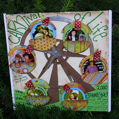
For the final round, I spent about 10 hours on my layout. Probably more than that considering that I sat on the design for about a day and a half to make sure I had really worked through all the issues. That helped so much. Because when I actually put it to paper, it worked. The little cars and the ferris wheel were the right scale and didn't hang off the edge too much. And all put together, it really looked like a ferris wheel.
Only a couple things really perplexed me. When I first put the ferris wheel together, it looked flat. It didn't have much depth. I could have stacked a piece of cardboard or 2 to get the look, but I think it should have been handled with color. Something about the colors needed to be different to make the wheel pop from the base. Not sure. I'd be open to suggestions on that. (Like shadows in chalk on the background or a heavier black line on one edge?)
The other design flaw was the amount of empty space in the middle. It feels like something is missing. And maybe this goes back to the lack of depth. Maybe I should have added some flashing lights to the spokes. That'd draw the eye to the center. :-)
And John is so cute in his support of this. He joined me on the big comfy chair last night to look through all the entries one by one to see what the competition looked like.
Between Last Scrapper Standing and the 3 crops I've been to since April, I have gotten mad scrapping done this summer. And usually summer is a slow time for that hobby. For now, at least, the creativity is flowing and it feels good!
Ok... well wish me luck on the challenge. Can't wait til they post the results. :-)
Subscribe to:
Post Comments (Atom)


No comments:
Post a Comment